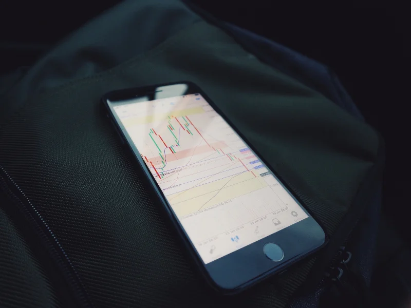
Chart analysis is at the base of any trader’s strategies and judgements, but there’s a lot to learn.
When you start out, completing chart analysis can be an intimidating prospect, especially if you’re examining different currency pairs.
From reading support and resistance levels to interpreting trend lines, pro trader and influencer Ken FX Freak gives us a simple rundown of what you need to know.
How do you start analysing charts?
Chart analysis is known as reading the ‘technicals’. It’s an essential part of trading and a skill that you should always look to get better at.
Whether you’ve just started out, or like me you’ve been in the industry for over 10 years, there are always ways that you can get better.
To break it down into its most simple form, analysing charts all comes down to looking at and interpreting the way that prices move.
It’s about reading data, like the movement of a currency pair, using indicators like support and resistance levels, as well as trend lines.
By reading the different levels and using trend lines, you can start to identify areas of significance that can help you make a judgement on where the market is going. You can feed this insight into your strategy and decide how you want to trade.
What are support levels?
As prices fall, they often find a natural ‘cushion’ or stopping point. This is known as a support level.
When prices hit a support level, they usually (but not always) pick back up and carry on moving to the upside (hence this level is giving the price the ‘support’ it needs to grow).
To identify and validate a support level, I’d always recommend looking towards the left side of the chart to compare against historical data. By doing this, you can look at a particular level and see whether it has been significant in the past i.e. has it historically been a place of resistance or support?
This gives you an understanding of what the key levels are and how the market may perform going forward.
What are resistance levels?
Similarly to support levels, resistance levels are where prices hit the top of their range before falling and consolidating themselves.
Looking for historical trends in resistance levels is just as important as looking for trends in support levels, as they both help to give an indication of where pricing limits might be set.
You can mark-up both resistance and support levels using trend lines to determine how the market has performed historically. These readings will help to validate your strategy and inform your expectations of how the market will perform in the future.
How do trend lines work?
By drawing trend lines, we can see where the high acting line of resistance and the low acting line of support fit on a specific section of data.
To make sure a trend line is drawn accurately, you need to make sure that the pricing line touches the trend line at least three times.
The space between the resistance and support trend lines is called a ‘channel’ or a ‘flag’. This can be used to determine the values between which a price may consolidate itself or start to rebound.
What’s the top tip for analysing charts?
My top tip when trying to improve your chart analysis is to use historical data. Data is always king when it comes to trading. The chances are that what you’re seeing in the market has happened before – there’s nothing new here!
So by looking left of the chart and analysing historical data, you can start to build some rules around why and how you’re going to trade and then backtest your strategy by looking at the data.
When you’re making a judgement, try out some trade examples that would have worked with your strategy using this historical data.
You can also do this to test and improve your analysis skills without needing to make a trade. Just analyse the data, write down your judgement and see if you’re proved right.
Continuing to test and learn is a key part of improving your trading. Try out these simple techniques and see how you get on.


