Forex charts are an essential part of making money on the exchange and learning how to read them is the key to your success. Hone your skills and increase your chances of making money with this short guide.
Getting to grips with forex charts
What is a forex chart?
A forex chart shows you the exchange rate between two currencies and how it has changed over time. If you’re just getting into forex trading, learning to use these charts will help you understand the markets.
You can view a forex chart for any currency pair of your choice, EUR/USD (Euros to US Dollars, GBP/JPY (British pounds to Japanese yen), and so on.
Forex charts and time frames
The period of time shown on a forex chart depends on the time frame you select.
Many forex charts are set to a daily time span by default, showing you the trading data over a 24-hour period. You can also select other time frames like minutes or months.
Learning to read advanced forex live charts and real-time trading charts will help you spot trends and seize opportunities to make money.
The different types of forex charts
Forex charts come in different forms, but the three most popular types of chart are line charts, bar charts and candlestick charts. Here’s what you need to know about each of them.
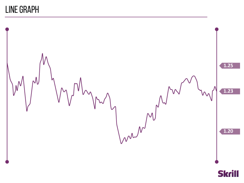
Line charts
The simplest of them all, line charts draw a line from one closing price to the next. When strung together with a line, they show you the rise and fall of a currency pair over time.
Bar charts
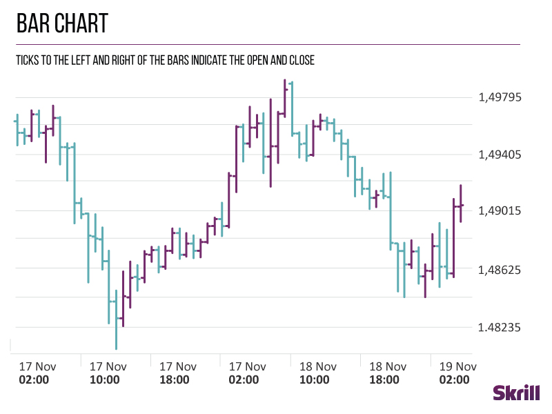
Bar charts are a bit more complicated but perfect for when you need more information. They show the opening and closing prices of a currency pair, as well as the highs and lows.
The bottom of a vertical bar displays the lowest traded price for that period, while the top shows the highest. The vertical bar indicates the currency pair’s overall trading range.
On the left side of a bar chart is the horizontal hash, which shows the opening price. On the right is a horizontal hash showing the closing price.
Candlestick charts
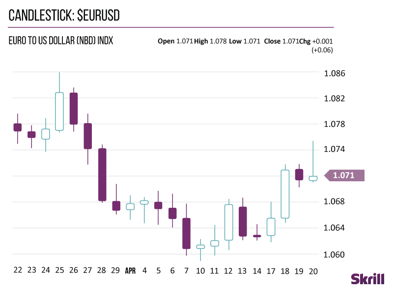
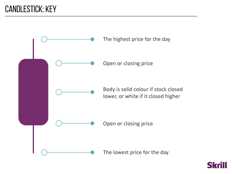
Like other forex charts, candlestick charts indicate the high-to-low trading ranges with a vertical line. For the data-hungry among us, they also use blocks in the middle to indicate the range between the opening and closing prices.
If the middle block is filled or coloured, the currency pair closed at a lower price than it opened. Whereas an unfilled or different coloured middle block shows that the closing price was higher than the opening price.
Forex indicators
Forex indicators help traders make sense of the currency movements they see on a forex chart. There are a lot of different forex indicators out there, but here are a few of the most popular.
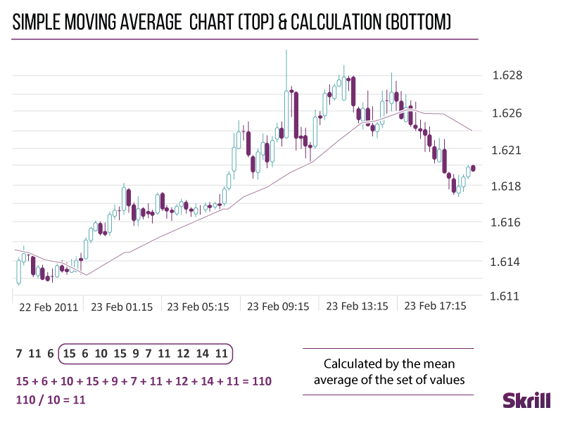
Simple moving average line
The most common forex indicator is the SMA or simple moving average line. This indicator is calculated by adding up the closing prices of a set period and dividing that number by the time within that period.
For example, if you’re adding up the closing prices from a period of five hours, dividing that total by five would give you the simple moving average line.
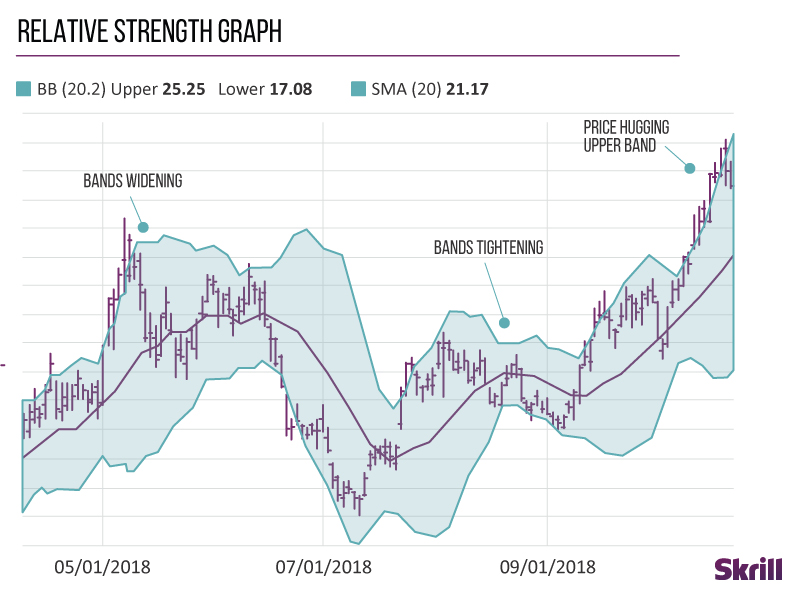
Bollinger Bands
Bollinger Bands measure how volatile the market is.
When Bollinger Bands come close together, it’s called a squeeze. Traders see squeezes as a sign that increased volatility and possible trading opportunities are on the horizon.
On the other hand, bands that are wider apart signal a decrease in volatility and increased likelihood of exiting a trade.
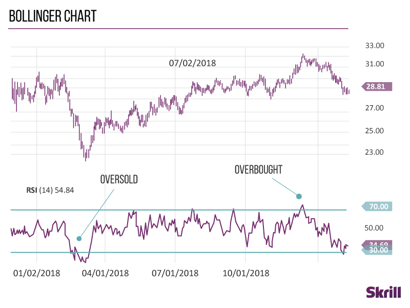
Relative Strength Index (RSI)
Traders use the Relative Strength Index to identify overbought and oversold conditions in the market.
Scaled from 0 to 100, a reading below 30 is a sign that the market is oversold and a trader should look to buy. Readings above 70 show the market is overbought and a trader should look to sell.


